For the next two weeks, I’m focusing (excuse the pun) on composition. All you have to do is choose the one(s) that emphasizes the subject or theme of the picture. That’s right, short stories and novels aren’t the only things with themes.
Rule of Thirds

Many amateur photographers tend to take photos with their subject smack bang in the middle of the picture. Ho hum! To avoid this, divide your frame into thirds—as in the above picture—and try to place your subject on one of the imaginary lines.
Selective Focus

By using a shallow depth-of-field, the background is blurred, which emphasizes the subject. This technique is only possible if you have a camera that allows you to adjust the aperture (AV). OR you can try fooling your camera into narrowing the depth-of-field by taking pictures in dimmer light. The camera will widen the lens opening to let in more light, thus blurring the background.
Size does count

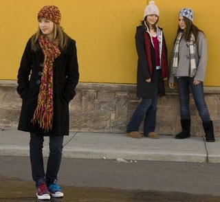
When you look at the above photo, where is your eye instantly drawn to? More than likely the teen on the left. Why? Because she’s the largest thing in the photo.
I emphasized her by moving closer in and by having her stand away from her friends—thus making her look bigger. Of course, other principles you’ve learnt so far also helped draw your attention to her. Her friends are slightly out of focus (shallow depth of field), they’re looking at her, and she’s standing to the side (rule of thirds).
Lighting for Emphasis


The contrast between light and dark is another way to emphasize your subject.
When you look at the photo on the center, the first thing you notice is the boy’s face. The distance of the window from the floor threw the dim north light predominantly on his face. For this picture, I underexposed it slightly to deepen the shadows. You can only do this trick if you can manually adjust the aperture (AV) and speed (TV) on your camera. Otherwise, your camera might try to compensate, and lighten the picture.
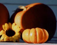
In the picture on the right, the little pumpkin pops out at you first. This was achieved by placing it in direct sunlight. The dark shadow on the pumpkin behind it also serves to emphasize it, as does curved pattern of light.
I’m going to LA later this week for the SCBWI conference. Part 2 of this post will be available August 9th. Also, there won't be a Cool Links Friday this week.
Have a great week, and I can't wait to meet some of you in LA.
<<<3